
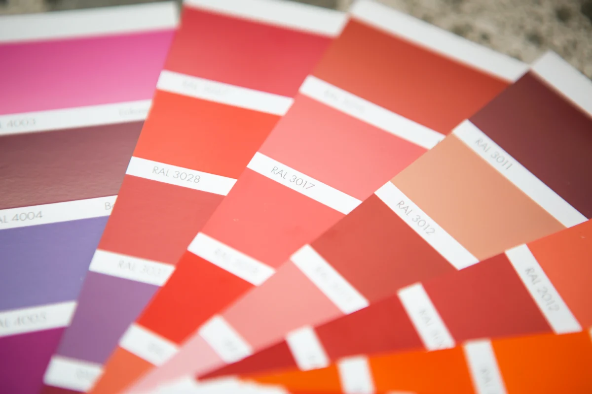
Anyone who has worked on the production floor of a dyeing unit knows how quickly a color approval can go wrong. A shade that looked perfect under the factory tube light suddenly looks “off” the moment the buyer opens the shipment under daylight. This is one of the most common — and costly — problems in textile manufacturing, and it’s exactly why Pantone Swatches exist.
Pantone swatches give manufacturers, dyers, merchandisers, and buying houses a shared, standardized language for color. Instead of relying on memory or subjective judgment, everyone in the supply chain — from the dye house in Tiruppur to the buying office in Bangalore to the brand headquarters overseas — can refer to the same physical reference point. That shared reference is what makes fabric color matching repeatable, rather than a guessing game.
In this article, we’ll walk through what Pantone swatches actually are, how they fit into the broader color approval workflow, the mistakes that most commonly derail shade matching, and how to choose genuine Pantone color products for your lab or production unit.
What Are Pantone Swatches?
Pantone swatches are physical color reference chips, cards, or fan decks produced under the Pantone Matching System (PMS) — a standardized color identification system used globally across textiles, printing, plastics, and design industries. Each swatch carries a unique code, so a shade referred to as “Pantone 19-4052 TCX” means the exact same color whether it’s being discussed in a mill in India or a design studio in Europe.
For the textile industry specifically, Pantone publishes dedicated fashion and home (FHI) color libraries, including cotton-based TCX chips and paper-based TPG chips, formulated to reflect how colors actually appear on fabric rather than on printed paper or plastic.
A few practical points worth understanding:
- Each swatch is manufactured under tightly controlled conditions to maintain consistent pigment, gloss, and surface texture.
- Swatches are periodically reissued because dyes and substrates age, and older chips can drift slightly from the original standard.
- Fan decks are organized by color family, making it faster to narrow down a shade during buyer discussions.
For textile professionals, these aren’t just color cards — they’re a quality control tool that removes ambiguity from an otherwise subjective process.
Why Pantone Swatches Are Important in the Textile Industry
Color is one of the first things a buyer notices, and it’s also one of the easiest things to get wrong across a long supply chain. A single garment order might pass through yarn dyeing, fabric processing, printing, and finishing — with different vendors handling each stage. Without a common reference, small variations accumulate.
This is where Pantone swatches earn their place on the lab table. They allow a merchandiser to communicate a shade requirement precisely, without relying on descriptive terms like “slightly darker navy” that mean different things to different people.
In day-to-day production, Pantone swatches are used to:
- Finalize shade approval before bulk dyeing begins
- Communicate color requirements between buying houses, mills, and dye units
- Reduce disputes during fabric inspection and shipment approval
- Maintain color consistency across multiple production lots and even multiple factories
For textile exporters working with international brands, this consistency isn’t optional — it’s often written directly into the buyer’s technical specification sheet, alongside acceptable color difference tolerances.
Understanding Pantone Color Standards
Pantone Color Standards refer to the codified, numbered shades within the Pantone system that serve as the “single source of truth” for a color. When a buyer specifies Pantone 18-1664 TPX for a garment, that code becomes the benchmark against which every dyed lot is measured.
This matters because human color perception is unreliable and highly dependent on lighting. A shade can look acceptable under fluorescent light and noticeably different under daylight or LED — a phenomenon known as metamerism. Pantone color standards, when viewed under controlled lighting conditions in a proper light booth, remove much of that inconsistency.
In practice, textile laboratories typically pair Pantone standards with:
- A calibrated light source (D65 daylight simulation is the most common reference)
- A spectrophotometer or colorimeter to measure Delta E (color difference)
- Documented tolerance limits agreed upon with the buyer
Organizations such as ISO and AATCC publish testing methods that many labs reference for color fastness and evaluation procedures, which work alongside Pantone standards rather than replacing them. Together, these tools form the backbone of a defensible, repeatable color approval process.
Step-by-Step Guide to Using Pantone Swatches for Fabric Color Matching
Here’s how the process typically plays out on a production floor or in a textile laboratory:
Step 1: Receive the color requirement. The buyer or design team specifies a Pantone code, either from a TCX cotton swatch or TPG paper swatch, depending on what was agreed upon in the technical pack.
Step 2: Match the lab dip. The textile lab prepares sample dyeing (lab dips) attempting to replicate the specified Pantone shade on the actual fabric substrate.
Step 3: Evaluate under controlled lighting. The lab dip and the Pantone swatch are compared side by side inside a colour matching cabinet or light booth, typically under D65 daylight, TL84, and sometimes UV or incandescent light sources to check for metamerism.
Step 4: Measure Delta E. A spectrophotometer quantifies the color difference between the lab dip and the standard. Most buyers set a tolerance, commonly around Delta E 1.0, though this varies by fabric type and buyer specification.
Step 5: Get buyer approval. Once the lab dip falls within tolerance, it’s sent for buyer approval, often as a physical swatch card with lot details attached.
Step 6: Scale to bulk production. After approval, the dye recipe is scaled up for bulk production, with periodic checks against the approved standard to catch batch-to-batch drift.
Step 7: Final fabric inspection. Before shipment, finished fabric rolls undergo fabric inspection to confirm the shade still matches the approved Pantone reference.
Common Mistakes to Avoid During Fabric Color Matching
Even experienced production teams run into avoidable errors. The most frequent ones include:
- Comparing swatches under poor or inconsistent lighting — natural window light, mixed bulb types, or dim workspaces all distort perceived color.
- Using worn or faded Pantone swatches — physical chips degrade with handling and UV exposure over time, so outdated swatch decks can mislead the entire approval process.
- Skipping the light booth check — relying only on visual comparison under one light source ignores metamerism, which can cause approved shades to look wrong once the buyer inspects them under different conditions.
- Ignoring fabric-specific dye behavior — the same Pantone code can behave differently on cotton, polyester, or blended substrates, so lab dip trials shouldn’t be skipped even for “familiar” shades.
- Not documenting tolerance limits clearly — vague verbal agreements about acceptable color difference lead to disputes later during fabric inspection or shipment.
Avoiding these issues comes down to discipline: consistent lighting conditions, well-maintained equipment, and clear documentation at every stage of the color approval process.
Pantone Swatches vs Digital Color Matching
Digital color matching tools have grown more common, especially with the rise of remote buyer-vendor relationships. But physical Pantone swatches and digital references serve different purposes, and most experienced labs use both.
| Aspect | Pantone Swatches (Physical) | Digital Color Matching |
| Accuracy on fabric surface | High — reflects actual texture, gloss, and dye behavior | Limited — screen colors vary by device and calibration |
| Consistency across locations | Very high, as long as swatches are genuine and unfaded | Depends on monitor calibration at each end |
| Speed of communication | Requires physical shipping of swatch cards | Instant, useful for early-stage discussions |
| Best use case | Final shade approval, bulk production reference | Initial concept sharing, remote pre-approval |
| Cost over time | One-time investment in genuine swatch books | Ongoing calibration and software costs |
| Regulatory/spec compliance | Widely accepted in buyer tech packs | Increasingly used but less standardized industry-wide |
In practice, digital tools are excellent for early conversations — sharing a rough color direction over email before samples are even cut. But when it comes to final shade approval and bulk production sign-off, physical Pantone swatches, evaluated under a proper light booth, remain the industry standard. Screens simply can’t replicate how a dye interacts with fabric texture the way a physical swatch can.
Best Practices for Maintaining Color Accuracy
Maintaining consistent color accuracy across seasons and production cycles takes more than owning a swatch book. A few practices separate labs that consistently pass buyer approval from those that struggle:
- Store swatches away from direct sunlight and humidity, since UV exposure and moisture both accelerate fading.
- Replace swatch decks periodically, following Pantone’s recommended refresh cycles rather than using the same book for years.
- Standardize your light booth settings across all vendors in your supply chain, so a mill and a buying house are always comparing shades under identical light sources.
- Calibrate spectrophotometers regularly to keep Delta E readings reliable.
- Train staff on visual assessment techniques, since even with instruments, human evaluation remains part of the final sign-off.
- Maintain a shade approval log documenting lot numbers, tolerances, and sign-off dates for traceability.
These habits reduce rework, shorten approval timelines, and build trust with buyers who audit color consistency across repeat orders.
Industries That Depend on Pantone Swatches
While textiles are a major user base, Pantone swatches support color communication across several connected industries:
- Apparel manufacturing — garment factories rely on swatches for trims, buttons, zippers, and fabric coordination.
- Fashion industry and design houses — designers reference Pantone’s seasonal color forecasts when planning collections.
- Textile exporters — shade consistency across export lots is often a contractual requirement.
- Buying houses — act as the communication bridge between international brands and local manufacturing units, using swatches to convey buyer expectations precisely.
- Home textiles and upholstery — bedding, curtains, and furnishing fabrics also depend on consistent color matching.
- Printing and packaging — brand colors on hangtags, labels, and packaging often need to align with the garment’s Pantone reference.
This cross-industry adoption is exactly why Pantone has remained the default color language for decades — it works the same way regardless of which part of the supply chain you sit in.
How Pantone Swatches Improve Textile Quality Control
Color consistency is a core part of textile quality control, alongside strength, shrinkage, and fastness testing. Pantone swatches feed directly into this process by giving quality teams a fixed benchmark to test against at multiple checkpoints:
- During lab dip approval, before any bulk dyeing begins
- At bulk dyeing stage, to catch batch variation early
- During in-line fabric inspection, to confirm the shade holds through processing and finishing
- At final audit, before goods are packed for shipment
Textile laboratories that integrate Pantone-based checks at each of these stages typically catch shade deviations early, when they’re cheap to fix, rather than after an entire lot has already been dyed. This is particularly important for garment manufacturing units running high-volume orders, where even a small shade drift across a large batch can result in significant rejected stock.
Choosing Genuine Pantone Color Products
Not all swatch books in the market are genuine, and counterfeit or reproduced Pantone products are a real problem in price-sensitive markets. Using unauthorized copies can be worse than not having a reference at all, since inaccurate pigments lead to incorrect shade approvals that only surface after bulk production.
When sourcing Pantone Color Products for your lab, look for:
- Official Pantone licensing and authentic packaging
- Clear batch or edition information printed on the product
- Supplier reputation within the textile testing equipment industry
- Compatibility with your existing color matching cabinet or light booth setup
Genuine swatches cost more upfront, but the cost of a single rejected export shipment due to a mismatched shade almost always outweighs the price difference.
Why Buy Pantone Swatches from Amith Garment Services
Amith Garment Services works closely with textile manufacturers, exporters, and buying houses across India’s garment manufacturing hubs, and understands the operational pressure that comes with tight buyer deadlines and strict shade tolerances. The Pantone color products available through Amith Garment Services are sourced to meet the accuracy and consistency that textile laboratories depend on for day-to-day shade approval work.
Beyond swatches themselves, Amith Garment Services also supplies complementary textile testing equipment — including color matching cabinets, light booths, and fabric inspection machines — so labs can build a complete, standardized color evaluation setup rather than piecing together equipment from multiple sources with inconsistent calibration standards.
If your lab is currently relying on outdated or unverified swatch books, it’s worth reviewing your current setup against genuine Pantone color standards before your next buyer audit.
Conclusion
Accurate fabric color matching isn’t a one-time task — it’s an ongoing discipline that touches every stage of production, from the first lab dip to the final shipment inspection. Pantone Swatches remain the most reliable way to keep that discipline consistent, because they give everyone in the supply chain — dyers, quality managers, merchandisers, and buyers — the same physical reference point to work from.
Whether you’re running a textile laboratory, managing quality for a garment exporter, or sourcing on behalf of a buying house, investing in genuine, well-maintained Pantone swatches pays for itself many times over in reduced rework and fewer rejected shipments. Explore the range of authentic Pantone color products and supporting textile testing equipment available at Amith Garment Services to strengthen your shade approval process.
Frequently Asked Questions
Pantone Swatches are used throughout the textile production process to establish, communicate, and verify color accuracy. They serve as the standard reference during lab dip approval, bulk dyeing, and final fabric inspection. Merchandisers use them to specify exact shades, while quality teams ensure dyed fabrics match buyer-approved colors before shipment. Since Pantone codes are recognized worldwide, they eliminate confusion between manufacturers, buying houses, and international brands.
Pantone Swatches provide highly accurate color matching when used under controlled lighting with properly maintained swatch books. For the best results, compare fabric samples inside a colour matching cabinet or light booth using standardized lighting such as D65 daylight simulation. Many textile laboratories also use spectrophotometers to measure Delta E values for precise color evaluation.
TCX (Textile Cotton eXtended) swatches are produced on real cotton fabric, making them ideal for textile dyeing and final shade approval. TPG (Textile Paper Green) swatches are printed on paper, offering a cost-effective solution for initial color selection and design discussions. Most textile manufacturers use TPG for early color planning and TCX for production approval.
Genuine Pantone Color Products should be purchased from trusted suppliers specializing in textile testing equipment. Amith Garment Services supplies authentic Pantone Color Standards along with light booths, colour matching cabinets, and other textile testing solutions for manufacturers, exporters, and buying houses across India.
Pantone Swatches are used to identify and communicate exact fabric colors during textile production. They provide a standardized reference that helps manufacturers, dye houses, and buyers achieve consistent color matching before bulk production begins.
Compare your dyed fabric sample against the corresponding Pantone Swatch under standardized lighting in a light booth or colour matching cabinet. If required, verify the color difference using a spectrophotometer and obtain buyer approval before proceeding with bulk dyeing.
Pantone Color Standards provide a universal color language for the textile industry. They reduce color communication errors, improve consistency between dye houses and buyers, and help maintain uniform shades across the entire textile supply chain.
You can buy genuine Pantone Color Products from Amith Garment Services. The company supplies authentic Pantone color standards along with professional textile testing equipment to textile manufacturers, exporters, and buying houses across India, including Bangalore and Tiruppur.