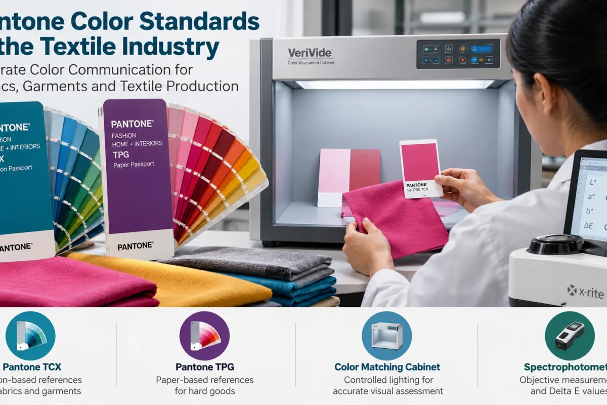
Pantone Color Standards give textile teams a shared language for color. When a designer, a dyeing unit, a garment factory and an overseas buyer must agree on one shade, a numbered physical reference removes a lot of guesswork. That matters in fabric development, dyeing, garment manufacturing and export quality control. It does not remove variation by itself, so this guide also covers how to use it well.
What Are Pantone Color Standards?
Pantone Color Standards are numbered, named color references that let people specify a target shade without describing it in words. A designer picks a code, the supplier receives the same code, and both compare their work with a physical reference. For textiles, the relevant system is Pantone Fashion, Home + Interiors (FHI).
A reference communicates a target. It does not guarantee an identical match on every fiber, finish or light source.
What are Pantone Color Standards?
Pantone Color Standards are numbered, named color references used to specify and communicate target shades across design, production and approval. In textiles, they give designers, mills, dyeing units and buyers a shared point of comparison, although the match on fabric still depends on material, finish and lighting.
Why Are Pantone Color Standards Important in the Textile Industry?
A shared reference matters most where several parties handle the same color:
- Specification: one code replaces vague descriptions like “dark navy”.
- Fabric and yarn development: teams know which shade they are aiming for.
- Dyeing and finishing: recipes can be built and corrected against a known target.
- Lab dip approval: buyer and supplier judge submissions against the same reference.
- Bulk production: the approved standard gives production something to check against.
- International trade: a code travels across borders more reliably than a verbal description.
This reduces avoidable discrepancies, but it cannot eliminate them. Fiber, dye chemistry and finishing still shape the result.
Why are Pantone Color Standards important in textiles?
They give buyers, mills and garment makers a common reference for specifying, developing and approving colors. This reduces miscommunication during lab dips and bulk production, especially in international sourcing, although fabric composition, dyeing and lighting still influence the final appearance.
Different Types of Pantone Color Guides Used in Textiles
Pantone offers several reference systems, and they are not interchangeable. Within Pantone Fashion, Home + Interiors, TCX references show colors on cotton, while TPG references show the same system as a lacquer on coated paper. Pantone positions TPG for hard goods such as ceramics, paint, cosmetics, accessories and leather, and TPG colors are designed to match back to TCX. The Pantone Formula Guide is a print and graphic design system, so don’t treat it as a textile reference by default.
| Pantone Reference | General Application | Important Consideration |
| Fashion, Home + Interiors (FHI) | Fashion, textiles, interiors | Parent system; confirm which format the buyer specifies |
| TCX (cotton) | Fabrics, garments, soft goods | Cotton-based, so closest to a textile substrate |
| TPG (paper) | Hard goods, accessories, leather | Lacquered paper; matches back to TCX but is a different surface |
| Formula Guide | Graphic design and print | Ink on paper; not textile-specific |
Always confirm the exact guide, edition and format with your buyer, and check Pantone’s official site for current product names.
What is the difference between TCX and TPG?
TCX references show Pantone FHI colors on cotton, suited to soft goods like fabric and garments. TPG references show the same system on lacquered coated paper, suited to hard goods such as accessories and leather. TPG colors are designed to match back to TCX, but they are different surfaces.
How Pantone Color Standards Work in Fabric Color Matching
A typical workflow looks like this:
- Select the reference the buyer specifies.
- Send the exact color code to the supplier.
- Prepare a lab dip or fabric sample.
- Compare the sample against the agreed reference.
- Assess it under suitable lighting.
- Measure color difference instrumentally when required.
- Obtain buyer approval before bulk production.
- Run production checks to monitor consistency.
A good lab dip can still look “off” because the standard and your fabric are different materials. Fiber composition, dye chemistry, construction, texture and finishing all change how light reflects, so one color can look different on cotton, polyester or a brushed surface.
How do textile manufacturers match fabric colors to Pantone references?
They receive the specified code, prepare lab dips, and compare them with the physical reference under controlled lighting. Where required, they measure color difference with a spectrophotometer, then seek buyer approval before bulk dyeing and keep checking production batches.
Pantone Color Standards vs. Digital Color Codes
RGB and HEX describe color as light mixed on a screen. A Pantone reference is a physical object seen by reflected light. The same HEX code can look different on two devices, and neither reproduces a dyed fabric exactly.
| Aspect | Pantone physical reference | RGB / HEX |
| Medium | Physical sample | Light emitted by a screen |
| Viewing | Reflected light; depends on the light source | Depends on device, brightness, calibration |
| Best use | Specification and approval | Early design and quick sharing |
| Limitation | Specific to its substrate | Cannot represent every textile color |
Use screens for early concepts and physical references for approval.
Can a Pantone color look different on fabric and on a screen?
Yes. Screens emit light and vary by brightness and calibration, while fabric reflects light and is affected by fiber, texture and finish. A digital swatch is only an approximation, so approvals should rely on physical references and samples.
The Role of a Color Matching Cabinet and Light Booth
A color matching cabinet, often called a light booth, gives evaluators a controlled environment for visual assessment. Instead of judging a shade near a window or under factory tube lights, they compare the approved reference and the production sample under defined light sources with neutral surroundings.
This matters because of metamerism: two samples can match under one light and differ under another, often because different dyes or pigments were used. Checking under more than one light source exposes this before bulk goes out.
Which illuminants and procedure apply depends on the buyer’s requirements and the relevant test protocol, so follow the buyer’s instruction rather than assuming a default.
Why is a color matching cabinet used in textile quality control?
It provides standardized, repeatable lighting so evaluators can compare fabric samples with approved references fairly. It also helps reveal metamerism, where colors match under one light source but differ under another, before bulk production proceeds.
How Spectrophotometers and Delta E Help with Color Assessment
A spectrophotometer measures the light a fabric reflects across the visible spectrum and converts it into numerical color data. Delta E (ΔE) expresses the difference between two measured colors, such as standard versus sample, as a single number.
What a given ΔE means depends on the color-difference formula, measurement conditions, the material and the buyer’s acceptance criteria. There is no universal limit that suits every fabric or customer, so use the tolerance in the buyer’s specification. Instrument data complements visual assessment rather than replacing it. Numbers are objective and repeatable, while visual checks catch what the end customer will actually see.
Common Challenges in Pantone Color Matching
Typical causes of color variation include:
- Fiber composition, dye selection and dye concentration
- Fabric construction and surface texture
- Dyeing and finishing conditions, and batch-to-batch variation
- Different lighting, and different instrument settings or measurement conditions
- Comparing a physical reference with a screen
- Choosing the wrong reference, such as a print-oriented guide for fabric
- Weak lab dip approval procedures
Practical fixes: confirm the reference system in writing, fix the lighting and measurement conditions, and agree how many lab dip rounds and which criteria apply.
How to Maintain Color Consistency in Textile Production
- Use the agreed reference and record the color code, edition and approved sample details.
- Prepare and evaluate samples the same way every time.
- Assess under agreed lighting, and add instrumental readings when specified.
- Document buyer-approved acceptance criteria and every lab dip approval.
- Monitor bulk dyeing and finishing batches against the approved standard.
- Report deviations to the buyer before production continues.
A Pantone reference says what the color should be, not how well it will hold up. Rubbing and wash fastness are tested separately with crock meters and wash-fastness testing instruments.
Choosing the Right Pantone Color Products for Your Business
Start with the application. A mill working to a buyer’s TCX specification needs a cotton-based guide, while a team developing accessories may need TPG. Don’t substitute a print-oriented Formula Guide for textile work. Then consider how many colors you need, whether you need physical guides for every desk, how updates and replacements are handled, and whether the guide matches what your buyers specify. Finally, decide whether you also need a color matching cabinet or other testing equipment to evaluate samples consistently.
Pantone Color Standards in India’s Textile and Garment Industry
India’s textile industry spans fabric dyeing and processing through to garment manufacturing. Business and sourcing hubs such as Bangalore and Tiruppur show how many parties may handle one color before it reaches a retailer: textile exporters, processing units, buying house teams and international buyers. When each reads the same code from the same physical reference, fewer shade questions travel back and forth across time zones. Buyer requirements commonly name the reference system and approval steps, so confirm them at the start of an order.
Why Choose Amith Garment Services?
Amith Garment Services is a Bangalore-based supplier of textile testing and quality-control instruments, established in 1999 according to its website. Its range includes Pantone color standards, fabric inspection machines, GSM cutters, crock meters, bursting strength testers and colour fastness testing instruments, along with calibration services. Labs that check color usually also check GSM, rubbing fastness, fabric defects and strength, so planning instruments as one workflow can simplify setup. Explore the Pantone Color Standards page, or contact the team through the website for product information.
Conclusion
Pantone Color Standards help teams communicate target colors and stay coordinated from development to delivery. They work best alongside suitable lighting, documented lab dip approvals and consistent quality-control checks, with instrumental measurement added when the buyer requires it. Put those pieces in place, and your team will get far more from Pantone Color Standards.
Frequently Asked Questions:
1. What are Pantone Color Standards in the textile industry?
Pantone Color Standards are numbered, named color references that help designers, mills, dyeing units, garment manufacturers and buyers agree on a target shade. In textiles, the relevant system is Pantone Fashion, Home + Interiors, which includes cotton-based TCX and paper-based TPG references. A reference communicates the intended color, but the final result on fabric still depends on fiber, dyes, finishing and the lighting used for assessment.
2. What is the difference between Pantone TCX and TPG?
TCX references present Pantone Fashion, Home + Interiors colors on cotton, making them suitable for fabrics, garments and other soft goods. TPG references present the colors on coated paper with a lacquer finish and are intended for hard goods such as ceramics, paint, cosmetics, accessories and leather. TPG colors are designed to match back to TCX, but the surfaces differ, so confirm which format your buyer specifies.
3. How do Pantone references help with fabric color matching?
Pantone references give everyone the same color target. The buyer specifies a code, the supplier prepares a lab dip or sample, and the team compares it with the physical reference under agreed lighting. Where required, a spectrophotometer provides Delta E color-difference measurements. Buyer approval should be obtained before bulk production. The reference supports communication and comparison but cannot guarantee an exact match on its own because fabric and finishing influence color.
4. Which equipment helps assess textile colors accurately?
Visual assessment is usually performed in a color matching cabinet or light booth, which provides controlled lighting for comparing samples with approved references. A spectrophotometer adds objective measurements and Delta E values. Physical Pantone guides provide the color reference, while lab dyeing equipment supports lab dip preparation. The appropriate illuminants, formulas and tolerances depend on buyer requirements and the relevant test protocol.
5. What are Pantone Color Standards used for?
Pantone Color Standards are used to select, describe and approve specific colors. In textiles, they help designers, mills and buyers agree on a shade so everyone works toward the same target during product development and production.
6. How do I match a fabric to a Pantone color?
Start with the Pantone code specified by the buyer. Prepare a lab dip, compare it with the physical reference under controlled lighting, and measure the color difference if required. Obtain buyer approval before starting bulk production.
7. What is the difference between TCX and TPG?
TCX presents Pantone Fashion, Home + Interiors colors on cotton, making it suitable for fabric and garment applications. TPG presents the colors on coated paper and is intended for hard goods such as accessories. Confirm which format the buyer requires before ordering.
8. Which equipment helps check fabric color under standard lighting?
A color matching cabinet, also called a light booth, provides controlled lighting for comparing fabric with a color reference. A spectrophotometer can provide measured color-difference data when required by the buyer or testing procedure.