
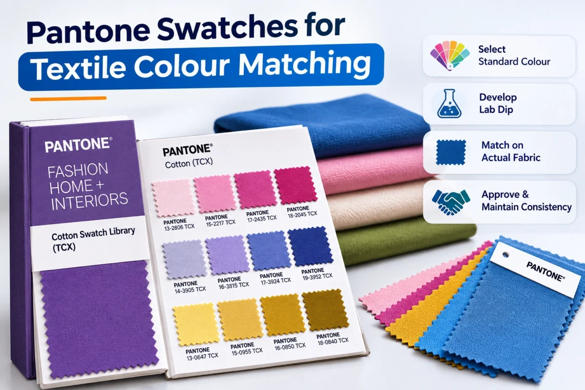
Pantone Fabric Swatches,Pantone TCX Swatches,Textile Colour Matching,Fabric Colour Standards,Pantone Colour Matching,Pantone Colour Guide for Textiles

Pantone Swatches for Different Fabric Types: Cotton, Polyester, Nylon and Blended Fabrics

Pantone Swatches give designers, dyers and buyers one numbered reference for a shade. That shared language helps at every step, from fabric development to garment approval. But a colour code is only the starting point. The same Pantone colour reference can look different on cotton, polyester, nylon or a blend, because each fibre takes dye in its own way. This guide explains how Pantone Fabric Swatches behave across fabric types and how to keep textile colour matching dependable from lab dip to bulk production.

What Are Pantone Swatches in the Textile Industry?

Pantone Swatches are physical colour references that give each shade a unique code. Textile teams use them to specify, communicate and approve colour between designers, dyers, manufacturers and buyers. They act as a visual target, not a guarantee of an identical result on every material.

Dyeing units and garment factories keep a Pantone Textile Colour System set on the desk so everyone looks at the same physical chip. A name like “sky blue” means different things to different people. A code does not.

Why Are Pantone Swatches Important for Textile Colour Matching?

Pantone Swatches matter because they remove guesswork from colour communication. They help dyers aim at a clear target, help merchandisers brief mills precisely, and give buyers a firm reference for shade approval. That reduces colour discrepancies between lab dips, bulk batches and finished garments.

Consider a navy polo order. The buyer sends a code, the mill develops a lab dip, and the factory checks bulk against the approved sample. Without that chain, each party judges “navy” differently, and colour variation in fabrics turns into rejections. The same reference supports colour consistency across batches and clear fabric colour standards in production control.

Understanding Pantone Swatches for Different Fabric Types

Yes, the same Pantone colour can look different on cotton and polyester. Fibre structure, dye chemistry, surface texture and finishing all change how light reflects, so a shade may look deeper, brighter or flatter. That is why every shade should be approved on the actual production fabric. Woven or knitted construction, brushing and heat-setting add further variation.

Pantone Swatches for Cotton Fabrics

Cotton is a cellulosic fibre that absorbs dye readily, and reactive dyes are the usual choice. Shade depends on pretreatment, dye fixation and finishing, so a poorly prepared batch can drift. Knitted cotton often looks softer than woven cotton in the same dye. Because TCX references are cotton themselves, cotton is the fabric closest to the reference material. Typical uses include T-shirts, shirts and bedsheets.

Pantone Swatches for Polyester Fabrics

Polyester is hydrophobic, so it is normally dyed with disperse dyes at high temperature. Heat-setting before dyeing and the dyeing conditions both influence the final shade. Synthetic surfaces often reflect light differently, so a shade can look sharper on smooth polyester than on a cotton chip. Deep shades demand careful control. You will find polyester in sportswear, uniforms and performance garments.

Pantone Swatches for Nylon Fabrics

Nylon has an affinity for acid dyes, and dye uptake is sensitive to bath conditions such as pH and temperature. Uneven uptake can show as streaks or lot-to-lot differences, so process control protects colour consistency. Nylon is common in activewear, hosiery and technical textiles. Pantone’s range also includes nylon-based references such as the Nylon Brights Set, which give a fibre-relevant visual target.

Pantone Swatches for Blended Fabrics

Blends such as cotton-polyester, polyester-viscose and nylon-spandex combine fibres that dye differently. Cotton needs reactive dyes while polyester needs disperse dyes, so blends often need combined or sequential dyeing.

Fabric composition matters in colour matching because each fibre absorbs and reflects dye differently. In a blend, one fibre can take colour faster or stay lighter, creating a heathered or uneven shade. Testing the actual fabric composition is the only reliable way to confirm a match.

Fabric Type Common Dyeing Approach Colour Matching Considerations
Cotton Reactive dyes Absorption, pretreatment and finishing
Polyester Disperse dyes Dyeing temperature, heat setting and dispersion
Nylon Acid dyes Fibre affinity, dye bath conditions and finishing
Blended Fabrics Depends on fibre combination Compatibility of dyeing processes and fibre composition

These are common approaches. Actual processes depend on fabric construction, composition and finishing.

How to Use Pantone Swatches for Accurate Fabric Colour Matching

Manufacturers match Pantone colours by choosing the reference, identifying the fabric composition, developing a lab dip on that fabric and comparing it with the physical swatch under controlled light. Once the buyer approves the sample, it becomes the reference for bulk production.

  1. Select the required Pantone colour reference.
  2. Identify the fabric composition.
  3. Prepare a fabric sample.
  4. Carry out laboratory dyeing or sample development.
  5. Compare the dyed sample with the physical reference.
  6. Evaluate it under controlled lighting.
  7. Obtain buyer or client shade approval.
  8. Keep the approved sample for bulk production.

Viewing conditions decide the result. A Colour Matching Cabinet with D65, TL84 and UV sources lets teams judge colour under standard light, and our guide to D65, TL84 and UV light sources explains the differences. Lab dips are typically developed on lab dyeing machines.

Pantone TCX Swatches vs Regular Colour References

Pantone TCX Swatches are cotton-based references from Pantone’s Fashion, Home + Interiors system. TCX stands for Textile Cotton eXtended. Each colour is a small cotton fabric chip, which makes it a closer visual match for textile work than a printed paper chip.

Paper-based references, such as the TPG range, show colour on paper. TCX chips are cotton, so they behave more like fabric under light. Pantone describes its Cotton Swatch Library as a reference for textiles, apparel and soft home. Even so, a cotton chip cannot predict how polyester or nylon will look. Always verify colour on your actual production material. You can review the TCX and TPG editions listed under Pantone Color Standards.

Common Challenges in Pantone Colour Matching for Different Fabrics

Most shade disputes trace back to a few causes:

  • Fibre composition and dye absorption: blends and mixed yarns take colour unevenly.
  • Texture and surface: pile, brushing and weave change reflectance.
  • Lighting and metamerism: two shades match under one light and differ under another.
  • Temperature and processing: small changes in dyeing conditions shift shade.
  • Finishing treatments: softeners and resin finishes can alter appearance.
  • Batch-to-batch variation: lots drift without tight control.

A navy approved near a window can look greyer under shop tubes. That is metamerism, not necessarily a dyeing fault.

How to Maintain Colour Consistency in Garment Manufacturing

Consistency comes from discipline, not one tool:

  • Use standardised colour references and keep the approved lab dip.
  • Fix dyeing parameters for each fabric.
  • Judge colour under controlled lighting.
  • Use a spectrophotometer where objective, CIE-based measurement adds value.
  • Follow a clear fabric inspection process before cutting.
  • Run colour fastness testing. Rubbing can be checked on a Crockmeter and washing on a Washing Fastness Tester. Our colour fastness testing guide covers the methods.
  • Document approvals and test results.

Pantone references do not certify fastness. That is tested separately to ISO or AATCC methods.

Industries That Use Pantone Swatches

Garment manufacturing, textile dyeing and processing, fashion and apparel, home textiles, sportswear, uniforms, textile exporters and buying houses all rely on physical references. In India, hubs such as Tiruppur and Bangalore run lab dips and shade approvals every day, because overseas buyers expect documented colour approval before bulk. For exporters, a clear approved reference helps avoid costly rejections.

Choosing the Right Pantone Swatches for Textile Applications

Match the reference to the job. Consider fabric composition and construction, the intended garment, the colour system the buyer specifies, whether a physical sample is available, the lighting used for evaluation, and the approval requirements. When in doubt, ask the buyer which edition they approve against.

Why Choose Amith Garment Services?

Amith Garment Services is a Bangalore-based supplier of textile testing equipment and garment testing instruments, operating since 1999 according to its website. Its range covers colour evaluation tools, colour fastness instruments, a spectrophotometer, lab dyeing machines and fabric inspection equipment, which together support textile quality control. It also lists Pantone colour standards among its products. Please confirm editions and availability with the team directly.

Conclusion

Pantone Swatches make colour communication faster and clearer across cotton, polyester, nylon and blended fabrics. They do not replace testing. Reliable results still depend on the real fabric sample, dyeing conditions, finishing and controlled colour evaluation. Use Pantone Swatches as the shared target, then verify the match on your own material.

FREQUENTLY ASKED QUESTIONS

Pantone Swatches – Frequently Asked Questions

Find answers to common questions about Pantone colour matching, fabric types, TCX swatches and textile colour accuracy.

1. What are Pantone Swatches used for in the textile industry?

Pantone Swatches are used to specify, communicate and approve colour. Designers choose a shade, dyers develop a lab dip against it, and buyers approve the result using the same physical reference. This keeps everyone aligned from fabric development to garment production. Used with controlled lighting and documented approvals, Pantone Swatches support colour consistency across batches. They are a reference target rather than a guarantee, so the final match must always be checked on the actual fabric.

2. What is the difference between Pantone TCX Swatches and regular Pantone colours?

Pantone TCX Swatches are made on cotton fabric, while regular Pantone references such as paper-based guides show colour on paper. TCX stands for Textile Cotton eXtended and belongs to the Fashion, Home + Interiors system. Because TCX chips are fabric, they suit textile colour matching better than printed paper. However, even TCX chips cannot predict how a shade will look on polyester or nylon, so confirm it on production fabric.

3. Do Pantone colours look the same on cotton, polyester and nylon?

No, not exactly. Each fibre absorbs dye differently and reflects light differently, so one Pantone shade can look deeper, brighter or flatter from fabric to fabric. Cotton uses reactive dyes, polyester uses disperse dyes and nylon uses acid dyes, and finishing and texture add further changes. A close match is achievable with careful lab dipping, but identical appearance is not guaranteed. Approve the shade on each actual fabric.

4. How do textile manufacturers achieve accurate Pantone colour matching?

Manufacturers start with the Pantone reference, identify the fabric composition and develop a lab dip on that fabric. They compare it with the physical swatch under standard lighting, often in a colour matching cabinet, and may add spectrophotometer readings. After buyer approval, they keep the sample as the bulk reference and hold dyeing parameters steady. Colour fastness testing and batch inspection then protect the approved shade.

5. What are Pantone Swatches used for?

They're used to pick, describe and approve colours. A designer chooses a Pantone shade, the dyer matches it, and the buyer signs off using the same physical reference. It keeps everyone talking about the same colour.

6. How do you match Pantone colours with cotton fabric?

Start with the Pantone TCX reference, then dye a sample on your cotton fabric, usually with reactive dyes. Compare it to the swatch under standard light, adjust the recipe if needed, and get buyer approval before bulk.

7. Why does the same colour look different on polyester and nylon?

Because the fibres take dye differently. Polyester uses disperse dyes at high temperature, and nylon uses acid dyes. Their surfaces also reflect light differently, so even the same shade code can look slightly different.

8. Which Pantone colour guide is suitable for textile fabrics?

For textiles, the Pantone Fashion, Home plus Interiors system is the usual choice. The TCX cotton editions, like the Cotton Planner or Swatch Library, are popular because the chips are real cotton fabric.

Pantone Color Standards used for textile colour matching and quality control

What Are Pantone Color Standards and Why Are They Important?

What Are Pantone Color Standards?

Pantone Color Standards are the standardized colour references built around the Pantone Color System, where each shade carries its own identifier. A name like “sky blue” is open to interpretation. A code is not.

For textiles, designers typically cite codes from Pantone’s fashion and home range, often supplied as cotton-based swatches (TCX). Manufacturers then treat that code as the target during development, lab dipping and production.

Pantone Color Standards are standardized, coded colour references that let designers, buyers and manufacturers specify the same shade without relying on subjective names. Each colour has a unique identifier, which reduces misunderstandings during development, sampling and production, especially across suppliers and countries.

Why Are Pantone Color Standards Important in Textile Manufacturing?

Colour is usually the first thing a buyer notices and the first reason a shipment is questioned. A shared reference helps at every stage: fabric development, sampling, dyeing, printing, bulk production, buyer approvals and export documentation.

Picture a knitwear order. The buyer sends a code, the mill dyes a lab dip, and the garment factory cuts panels from two dye lots. Without a common reference, each party judges “close enough” differently. With one, the disagreement becomes a discussion about measurable deviation rather than opinion.

Why are they important? They give everyone in the supply chain the same colour target. That reduces sampling rounds, limits shade disputes, supports buyer approvals and makes quality control more objective across fabric, printing and garment production.

How Do Pantone Color Standards Work?

The usual workflow looks like this:

  1. The buyer or designer selects a colour reference.
  2. The code is communicated to the manufacturer.
  3. Lab dips or fabric samples are prepared.
  4. Colour is evaluated under controlled lighting.
  5. Recipes are adjusted where necessary.
  6. The approved shade becomes the production reference.
  7. Bulk production is checked against that approved standard.

How are Pantone colours used in textiles? Designers cite a code in the tech pack, mills and dyeing units use it as the lab-dip target, and quality teams compare bulk fabric or garments against the approved shade under controlled light.

One caution: the same code will not look identical on every material. Fibre type, dye chemistry, fabric construction, finishing, surface texture, printing method and viewing conditions all shift appearance. A Pantone reference is a target, not a guarantee of an exact physical match on every substrate.

Pantone Color Standards vs Pantone Colour Guides

The two terms are often used interchangeably, but they play different roles. Broadly, the standards are the coded colour references. The guides are the tools that present them.

Factor Pantone Color Standards Pantone Colour Guides
Purpose Define and codify reference colours Present those colours as physical or digital swatches
Colour Reference The coded shade identity A printed or dyed representation of it
Manufacturing Use Target for development and approval Visual aid in the office, lab or floor
Textile Application Specifying fabrics, trims and garments Substrate-specific guides (e.g., cotton) for selection
Quality Control Basis for deviation checks Visual comparison only; sensitive to light and ageing
Buyer Communication Codes in tech packs and approvals Shows intent alongside the code

Pantone offers several systems and formats, and the Pantone Matching System (PMS) is best known in print. Always confirm which one your buyer specifies.

Why Is Pantone Colour Matching Important for Fabrics?

Pantone colour matching links design intent to real cloth. It shapes shade development, lab dips, dyeing, fabric inspection, buyer approval and shade consistency in bulk.

What is Pantone colour matching? It is the process of adjusting a dye or print recipe until a fabric sample aligns with a chosen Pantone reference within an agreed tolerance, usually checked under standardized lighting before buyer approval.

Ordinary office light or window daylight is a poor judge. Both change through the day and with the weather. Controlled lighting gives every evaluator the same conditions, so a disagreement reflects the fabric, not the room.

Role of a Color Matching Cabinet in Pantone Colour Evaluation

A Color Matching Cabinet, also called a light booth, provides standardized light sources inside a neutral enclosure. Common options include daylight simulation, TL84 store lighting, and incandescent or UV sources.

Why several? Metamerism. Two samples can match under one illuminant and visibly differ under another, often because different dyes were used. Checking under multiple sources exposes this before the buyer does. This textile laboratory equipment lets mills, factories and buyers compare shades under the same conditions.

What is the difference between Pantone and a colour matching cabinet? Pantone supplies the colour reference; the cabinet supplies the lighting to judge it. One defines the target, the other standardizes how you view the target and the sample.

Why is controlled lighting important? Colour appearance changes with the light source. Standardized illuminants and neutral surroundings let evaluators compare shades consistently and reveal metamerism, so decisions don’t depend on time of day, weather or room.

Pantone Color Standards and Textile Quality Control

Standardized references support quality control at each checkpoint:

  • Incoming fabric inspection: confirming supplied fabric against the reference
  • Lab dip approval: documenting the accepted shade
  • Production monitoring: catching drift between dye lots
  • Shade grouping: keeping panels from the same garment visually consistent
  • Final inspection and buyer approval: verifying against the signed-off standard

Colour consistency shapes perceived quality. A sleeve slightly off from the body panel reads as a defect, even when every strength test passes.

Factors That Can Affect Colour Matching

  • Fibre and construction: the same dye looks different on cotton, polyester or a textured knit.
  • Dye selection and concentration: small recipe changes shift the shade.
  • pH, temperature and processing time: a bath that runs slightly hotter or longer can change results.
  • Finishing: softeners and resin finishes may alter depth or tone.
  • Viewing conditions: lighting, viewing angle and surface gloss change perception.
  • Instrument calibration and sample preparation: uncalibrated devices or unevenly conditioned samples give misleading comparisons.

Pantone Color Standards in Garment Exporting

International buyers often specify colours by code, and Indian manufacturers, dyeing houses and fabric suppliers work from the same reference. In hubs such as Tiruppur, where knitwear exporters manage large repeat orders, and in Bangalore’s garment manufacturing sector, that shared reference helps keep shade expectations aligned across the textile industry. For textile exporters, a documented approved standard also makes it easier to resolve questions after shipment.

How to Maintain Better Colour Consistency in Textile Production

  • Use a defined colour reference for every order.
  • Keep approved lab-dip standards on file.
  • Evaluate shades under controlled lighting.
  • Hold dyeing and finishing parameters steady.
  • Calibrate relevant instruments.
  • Compare bulk production with the approved sample.
  • Record shade deviations and maintain testing documentation.
  • Train quality-control personnel.

Distinguish the two assessment methods. Visual assessment relies on trained observers under standard light. Instrumental measurement uses a spectrophotometer to quantify colour difference numerically. Most laboratories use both, and both are commonly guided by AATCC and ISO practices.

Choosing the Right Textile Colour Testing Equipment

Consider the application, testing requirements, lighting needs, compatibility with the standards your buyers use, and how the equipment fits your laboratory workflow. Then look at repeatability, calibration, ease of operation, maintenance, documentation and production volume. A small sampling unit and a large export facility may need very different textile testing equipment. Garment testing instruments for colour should sit alongside those for fastness and physical properties, not in isolation.

Why Choose Amith Garment Services?

Amith Garment Services provides textile testing equipment and related solutions for textile and garment quality-control applications. The range relevant to colour and fabric evaluation includes the Color Matching Cabinet, Crock Meter, Washing Fastness Tester, GSM Cutter, Fabric Inspection Machine, Bursting Strength Tester and Fabric Rolling Machine. Together, these help laboratories check colour, fastness and physical properties in one workflow. For advice on matching equipment to your testing requirements, contact the team through the website.

Conclusion

Pantone Color Standards turn subjective colour talk into a shared, documented reference that suits the realities of textile manufacturing. They work best when combined with lab dips, controlled lighting, calibrated instruments and disciplined records. Used that way, they help mills, factories and exporters deliver colour their buyers expect.

Frequently Asked Questions

Pantone Color Standards are used to specify, communicate and verify colour throughout textile production. Designers cite a code in the tech pack, mills and dyeing units use it as the target for lab dips, and quality teams compare bulk fabric or finished garments against the approved shade. Because the reference is coded rather than described in words, it cuts down on misinterpretation between buyers, factories and suppliers. It works best when paired with controlled lighting and, where required, instrumental colour measurement.

Pantone colour matching gives garment manufacturers a clear target from the first sample. Merchandisers can brief the dyeing unit with a code instead of a vague description, which can shorten lab-dip rounds and reduce shade disputes at approval. During production, the approved standard lets quality teams judge whether dye lots and panels stay within tolerance. It also supports smoother communication with international buyers, who often specify colours by code, though the final match still depends on the fabric and process.

Not always. A Pantone reference is a colour target, but fabrics respond differently to dyes and finishes. Fibre type, yarn and fabric construction, dye class, finishing and surface texture all influence how a shade appears, so a colour achieved on cotton may look different on polyester or a textured knit. Some colours may also fall outside what a given dye system can reproduce. Manufacturers therefore prepare lab dips, evaluate them under standardized light, and agree tolerances with the buyer rather than assuming an identical match.

A Color Matching Cabinet provides standardized, repeatable lighting so shade comparisons don't depend on the time of day, weather or room. Most offer several light sources, such as daylight, store lighting, and incandescent or UV, which helps reveal metamerism, where samples match under one light but not another. Using the same conditions at the mill, the factory and the buyer's office makes Pantone Color Standards easier to apply consistently. It supports visual assessment but does not replace instrumental measurement when numerical data is required.

They define and communicate colour with a code instead of a description. In textiles, buyers and manufacturers use them to agree on a shade, prepare lab dips, and check bulk production against the approved colour.

First, the buyer picks a Pantone code. The mill prepares lab dips to match it, and the shade is checked under controlled lighting. Once approved, that sample becomes the production standard, and bulk fabric is compared against it.

Because a code means the same thing to everyone. Instead of arguing over what "olive green" means, buyers, dyeing units and garment factories work from one reference, which cuts down on shade misunderstandings and rework.

Place the fabric and the approved standard side by side in a colour matching cabinet, then view them under standard light sources such as daylight. If needed, confirm with a spectrophotometer to measure the colour difference numerically.